Table of Contents
ToggleFor creating a dashboard in Python in 2025 we have multiple options in terms of libraries. Dashboards are commonly used for displaying key metrics and insights. In this blog, we will discuss various libraries and frameworks for building a dashboard in Python.
Dash by Plotly
Dash is considered one of the most popular Python frameworks for building interactive, web-based dashboards. It combines features of Plotly, which is used for interactive charts, and Flask, which is a Python framework for web development. Making it simple to build real-time customizable dashboards with Python.
Key Features:
- Supports HTML and CSS styling making it possible to create interactive web dashboards easily.
- Can be Integrated with Plotly for interactive data visualizations
- Built-in support for callbacks that allow user interactivity.
Install dash with the following command
pip install dash
Let’s create a simple dashboard by plotting a scatter plot with a dropdown.
import dash
from dash import dcc, html
import plotly.express as px
import pandas as pd
# Load a sample dataset
df = px.data.gapminder()
# Create the Dash app
app = dash.Dash(__name__)
# Layout for the app
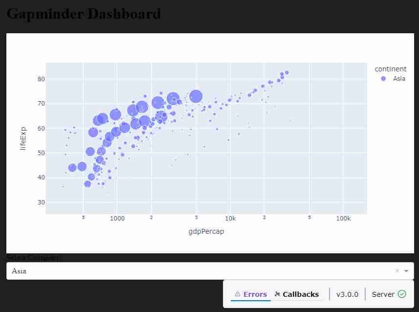
app.layout = html.Div([
html.H1("Gapminder Dashboard"),
dcc.Graph(
id='scatter-plot',
figure=px.scatter(df, x='gdpPercap', y='lifeExp', color='continent', size='pop', hover_name='country', log_x=True)
),
html.Label('Select Continent:'),
dcc.Dropdown(
id='continent-dropdown',
options=[{'label': c, 'value': c} for c in df['continent'].unique()],
value='Asia'
),
])
# Callback for interactivity
@app.callback(
dash.dependencies.Output('scatter-plot', 'figure'),
[dash.dependencies.Input('continent-dropdown', 'value')]
)
def update_graph(selected_continent):
filtered_df = df[df['continent'] == selected_continent]
return px.scatter(filtered_df, x='gdpPercap', y='lifeExp', color='continent', size='pop', hover_name='country', log_x=True)
# Run the app
if __name__ == '__main__':
app.run_server(debug=True)
Output
How it Works:
- Dash Layout: We have html.Div(), html.H1(), dcc.Graph(), etc. as HTML components in layout help us to create dropdowns, sliders, and graphs.
- Callbacks: using @app.callback decorator we can create interactivity between components. In the example above, the scatter plot updates based on the continent selected from the dropdown.
Using Streamlit library for building dashboard in Python
Streamlit is majorly used by data scientists as it helps to develop the frontend and backend of web based machine learning solutions using Python. It can also be used to develop a dashboard by just using Python.
I would recommend you to use streamlit if you don’t know much about HTML and CSS.
Key Features:
- Very simple and fast to build applications.
- Auto-updating interface.
- Can be easily integrated with Plotly, Matplotlib, Altair, and other visualization libraries. Goes well with any library in the Python ecosystem.
- Supports data input widgets like sliders, text boxes, and buttons.
Install streamlit using following command
pip install streamlit
Sample code for creating a dashboard using Streamlit.
File name → app.py
import streamlit as st
import plotly.express as px
import pandas as pd
# Load a sample dataset
df = px.data.gapminder()
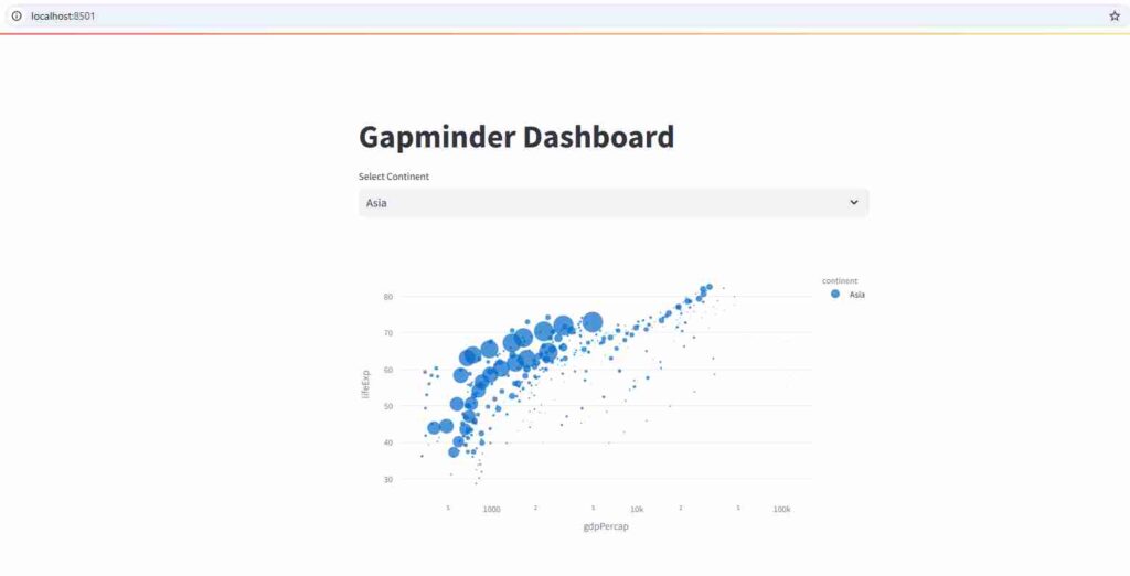
# Title
st.title("Gapminder Dashboard")
# Create a dropdown for selecting continent
continent = st.selectbox("Select Continent", df['continent'].unique())
# Filter data by selected continent
filtered_df = df[df['continent'] == continent]
# Plot the data using Plotly
fig = px.scatter(filtered_df, x='gdpPercap', y='lifeExp', color='continent', size='pop', hover_name='country', log_x=True)
st.plotly_chart(fig)
Output
- In streamlit we have widgets like st.selectbox(), st.slider(), st.text_input(), and more.
- The streamlit app automatically re-renders the UI as the user interacts with the widgets.
- The code structure is simple, allowing quick development.
streamlit run app.py
Panel
Panel library is built on top of Bokeh, Matplotlib, Plotly and other visualization libraries. It helps us to create web-based dashboards with interactive and custom layouts.
Key Features:
- We can plot using various libraries like Matplotlib, Plotly, and Bokeh.
- Has different layouts like grid layout, tabs, etc.
- Can be Integrated with Jupyter Notebooks, which is useful for interactive environments.
Install Panel using pip
pip install panel
Sample code:
import panel as pn
import plotly.express as px
import pandas as pd
# Load sample data
df = px.data.gapminder()
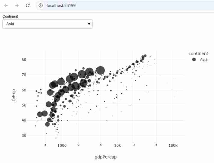
# Create a dropdown widget
continent_select = pn.widgets.Select(name='Continent', options=list(df['continent'].unique()))
# Create a Plotly figure based on the selected continent
def plot_figure(continent):
filtered_df = df[df['continent'] == continent]
fig = px.scatter(filtered_df, x='gdpPercap', y='lifeExp', color='continent', size='pop', hover_name='country', log_x=True)
return pn.pane.Plotly(fig)
# Set up the dashboard layout
dashboard = pn.Column(continent_select, pn.bind(plot_figure, continent_select))
# Display the dashboard
dashboard.show()
Output
How it Works:
- The panel has interactive widgets, including sliders, text boxes, and select boxes.
- We can arrange widgets and plots in different layouts using Column, Row, and GridSpec.
- The pn.bind() function helps us to bind the input from widgets to the update function for dynamic plots.
Using Bokeh library to create dashboard in Python
Bokeh is a Python interactive visualization library that can be used to build complex dashboards with real-time updates. It uses JavaScript for interactive plotting which allows for building high-performance dashboards
Key Features:
- It has Interactive visualizations like zooming, panning, and tooltips.
- High-performance rendering and responsive design.
- It can be integrated with web frameworks like Flask or Django for building web applications.
Install Bokeh using pip
pip install bokeh
Sample code:
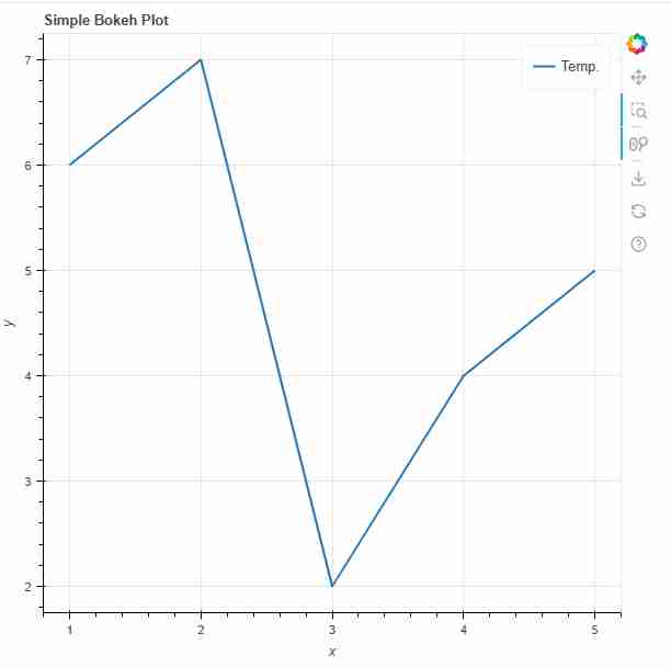
from bokeh.plotting import figure, output_file, show
from bokeh.io import push_notebook
import pandas as pd

# Load data
df = pd.DataFrame({
    'x': [1, 2, 3, 4, 5],
    'y': [6, 7, 2, 4, 5]
})

# Create a figure
p = figure(title="Simple Bokeh Plot", x_axis_label='x', y_axis_label='y')

# Add a line renderer
p.line(df['x'], df['y'], legend_label="Temp.", line_width=2)

# Output the plot to a static HTML file
output_file("plot.html")
show(p, notebook_handle=True)
Output
Best Practices for creating Dashboard in Python:
- Responsive layout: Every dashboard that we make must adjust well to different screen sizes. The libraries like Dash, Panel, and Streamlit automatically adapt to screen sizes, but for complex layouts, more code has to be written.
- Interactivity: Users should be allowed to interact with data. The dashboard should have interactive elements like dropdowns, sliders, checkboxes, and text inputs.
- Performance: The dashboard should reflect in real-time for data updation and interactivity with data.
Summary:
- We can use Dash for building interactive dashboards with callbacks.
- Streamlit is good for rapid prototyping and simple dashboards.
- If you want to develop complex layouts and integration with multiple plotting libraries then Panel is a good choice
- Bokeh is excellent for high-performance interactive visualizations
By using these libraries we will build dashboards in Python.
You can also read about our other blogs on pandas interview questions and how to data analyst internship in 2025.